Marketing & Strategy
Two strategy projects: a campaign to bring a younger audience to Häagen-Dazs, and EKEA, a sustainable collection for IKEA.
Häagen-Dazs
The challenge
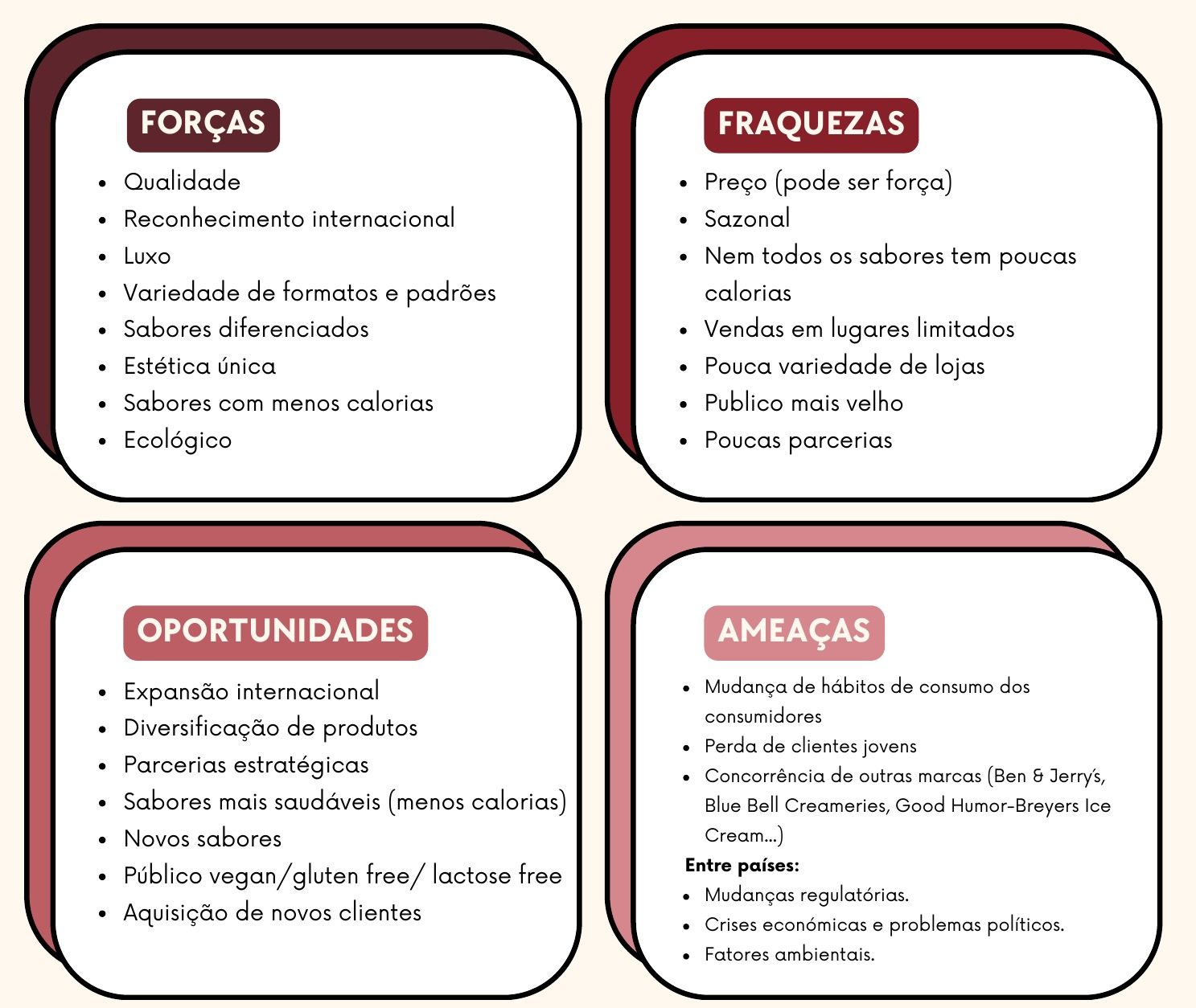
Founded in 1961, Häagen-Dazs is a premium ice cream brand known for its carefully selected ingredients. From 2018 it began losing customers, as young people saw it as a brand for older consumers. When it updated its packaging, sales grew by 66%, which showed how much packaging matters to this audience.
Brand and market analysis
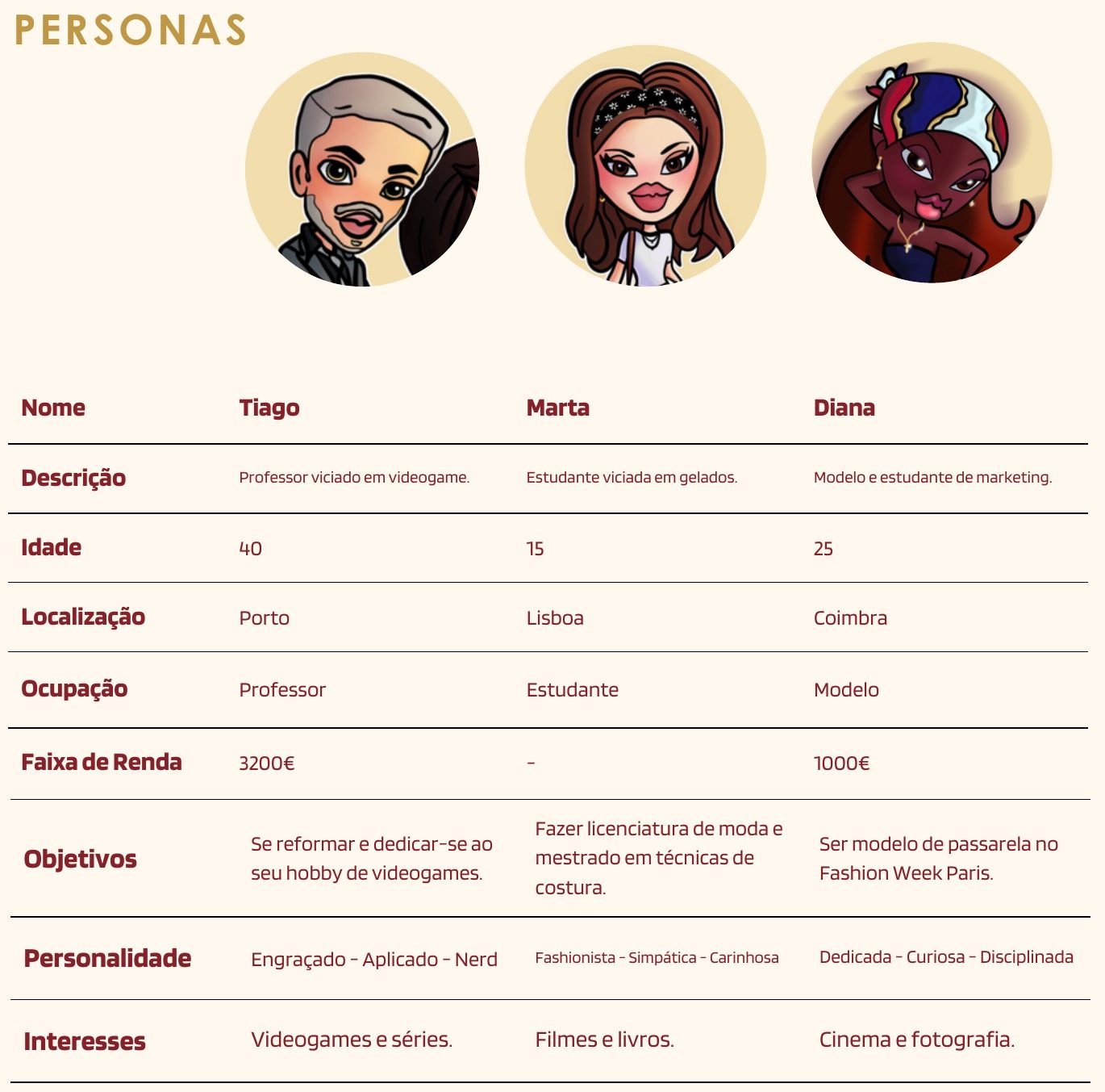
We studied the brand identity and archetypes, competitors such as Ben & Jerry's and Magnum, the marketing mix, a SWOT analysis, Porter's five forces and the BCG matrix. Three personas, from a 15-year-old student to a 40-year-old teacher who loves video games, helped us cover the wide audience of the campaign.
Objectives and concept
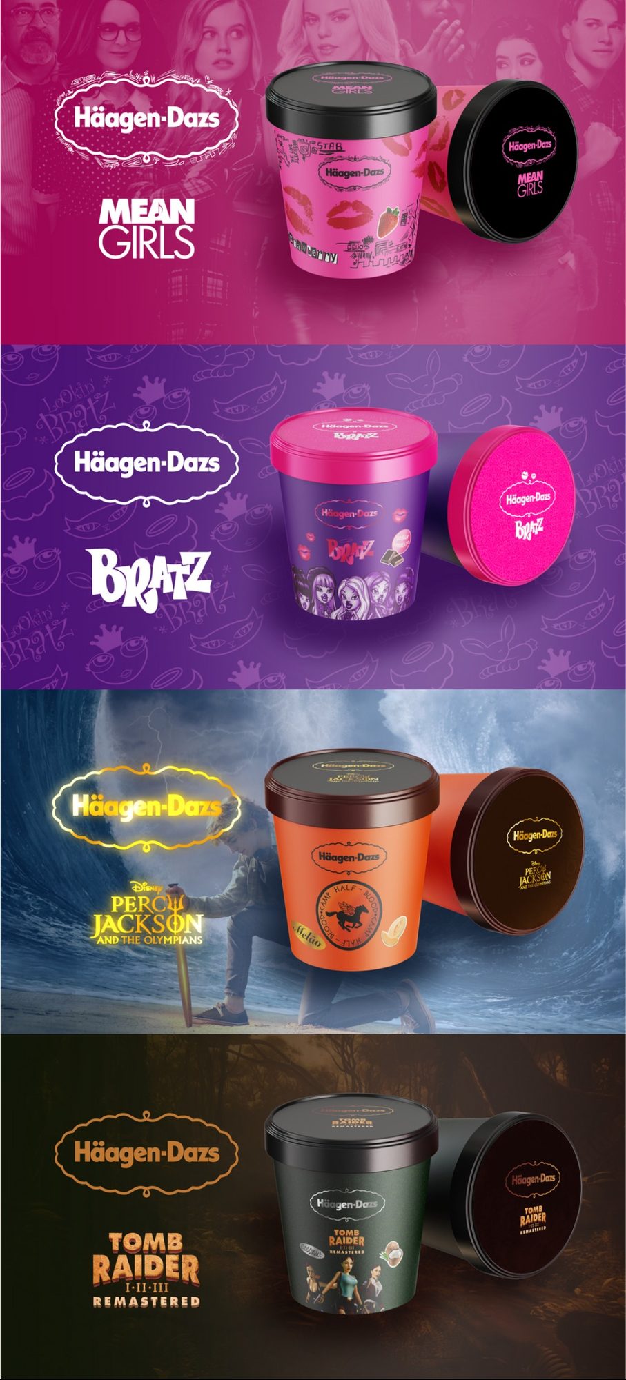
Our goals were to attract a younger audience, boost sales through the excitement of new themes, and modernise the brand in line with current trends. The partners were chosen because they are relaunches of late-90s and early-2000s classics, so they reach young people and, through nostalgia, older fans too.
Packaging and moodboard
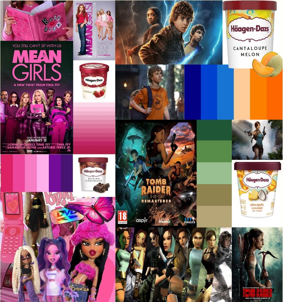
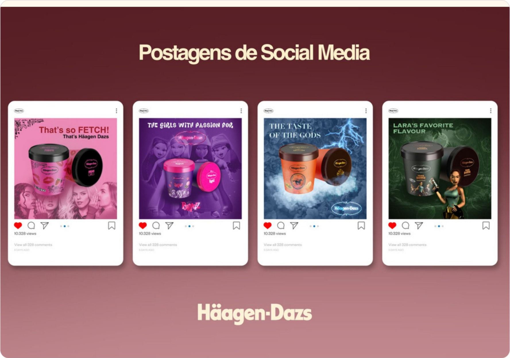
Each pint keeps a classic flavour, such as strawberry for Mean Girls and melon for Percy Jackson, and takes on the visual world of its partner. The moodboard brought together posters, characters and colour palettes from each franchise.
Kiosks and cinema
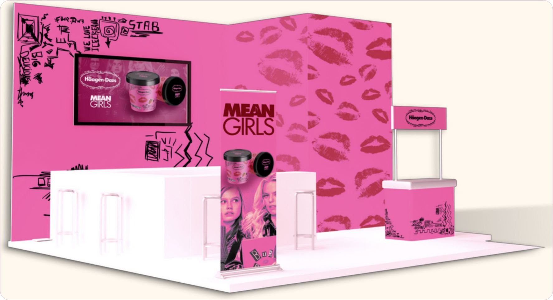
Themed Häagen-Dazs kiosks in strategic places in Lisbon would make the partnership "instagrammable", with tastings and celebrity appearances on opening days. The Mean Girls ice cream would also be sold in cinemas as a bundle with popcorn and a drink.
Social media
Sponsored TikTok posts with animated packaging, gifts sent to the actors and creators of each franchise to share in their stories, and Instagram posts with humorous references, such as "That's so fetch! That's Häagen-Dazs".
Survey results
We surveyed 49 potential consumers to test the concept before presenting it.
Conclusion
By changing only the packaging and keeping the existing flavours, the campaign speaks to a younger audience while respecting older customers through nostalgia, bringing together the best of both worlds.
EKEA by IKEA
Understanding IKEA
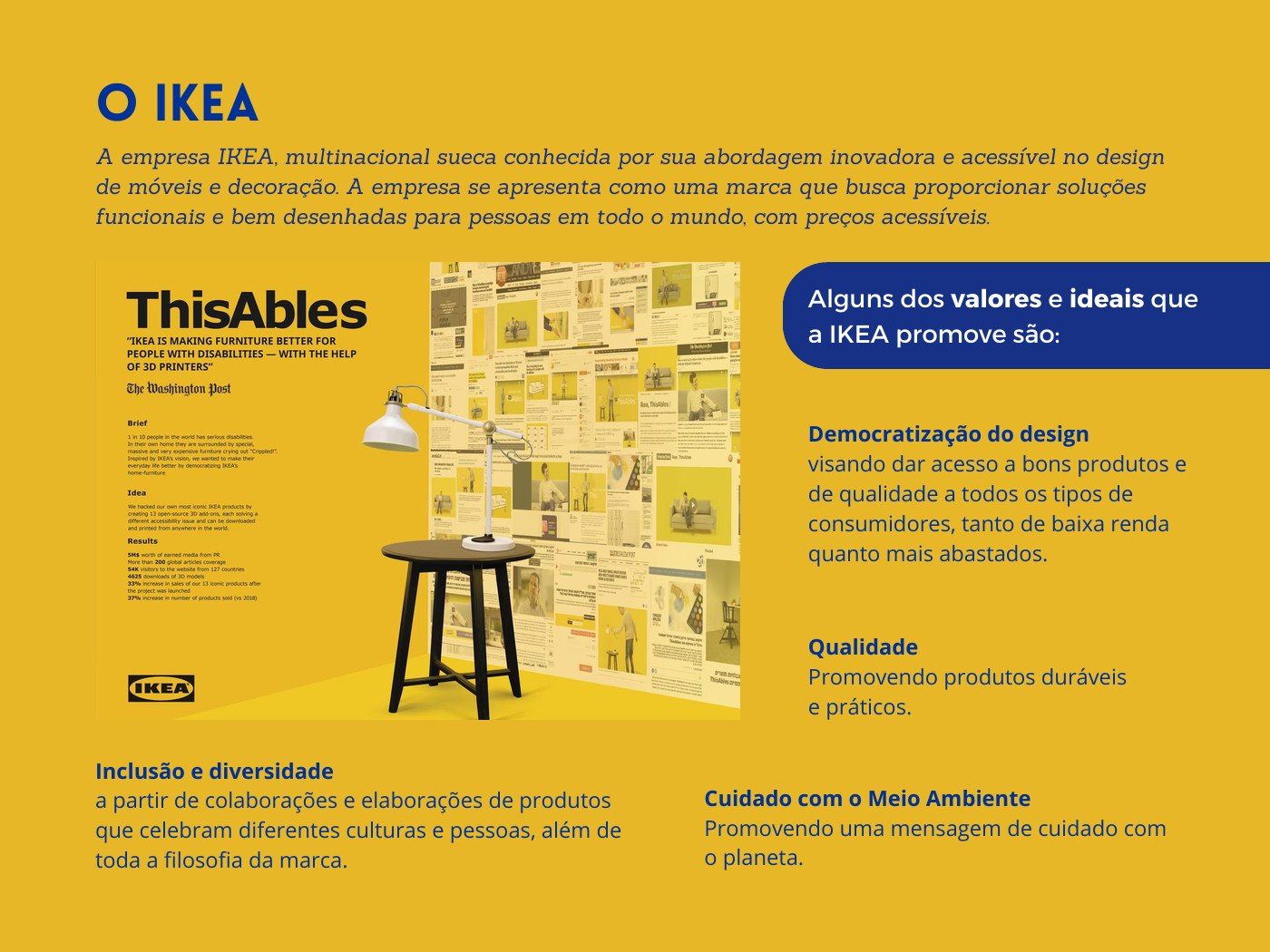
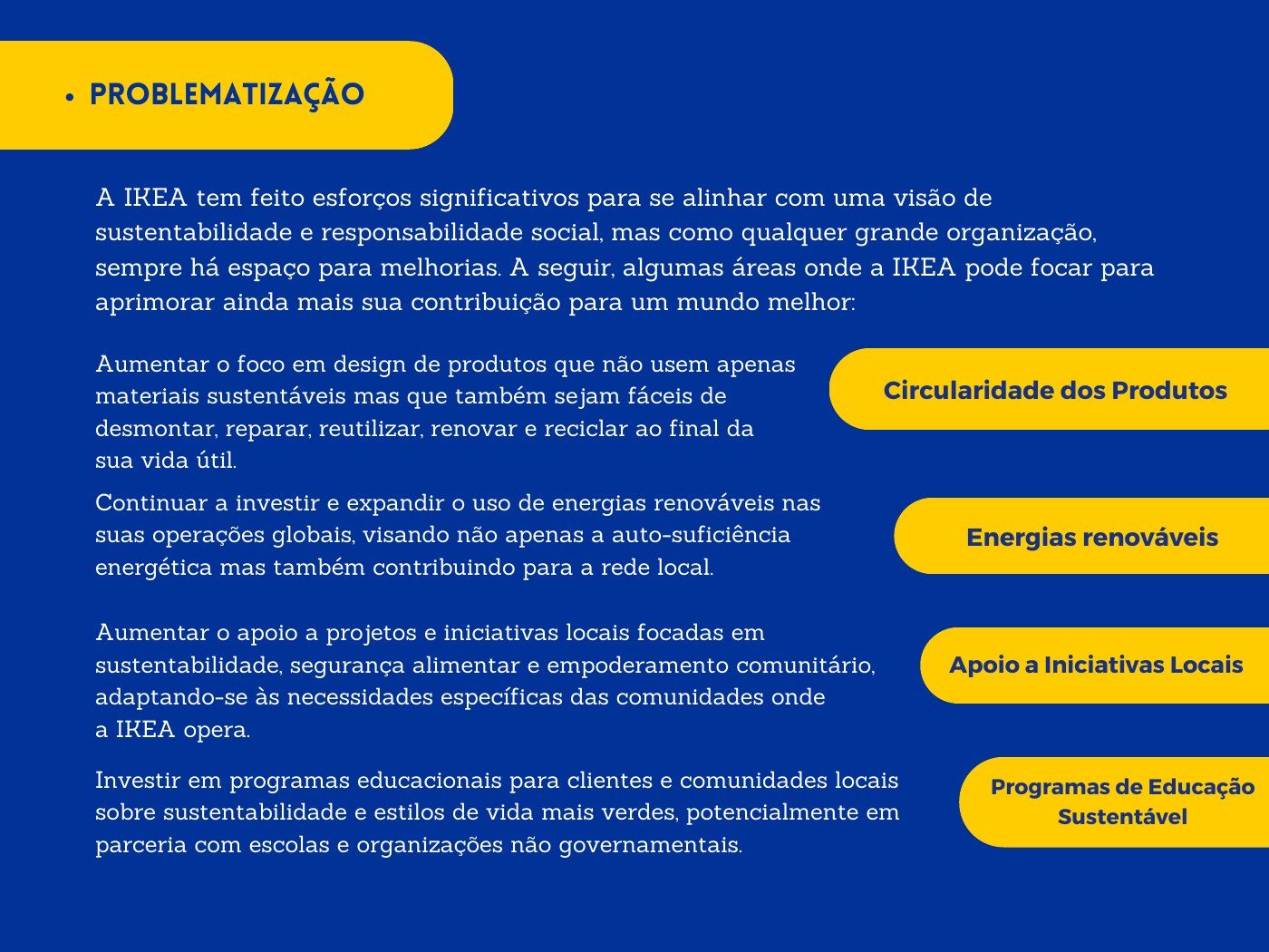
We started by studying IKEA's vision and values: democratic design, quality, inclusion and care for the environment. We then identified where the brand could still improve, such as product circularity, renewable energy, support for local initiatives and education on sustainable lifestyles.
The EKEA concept
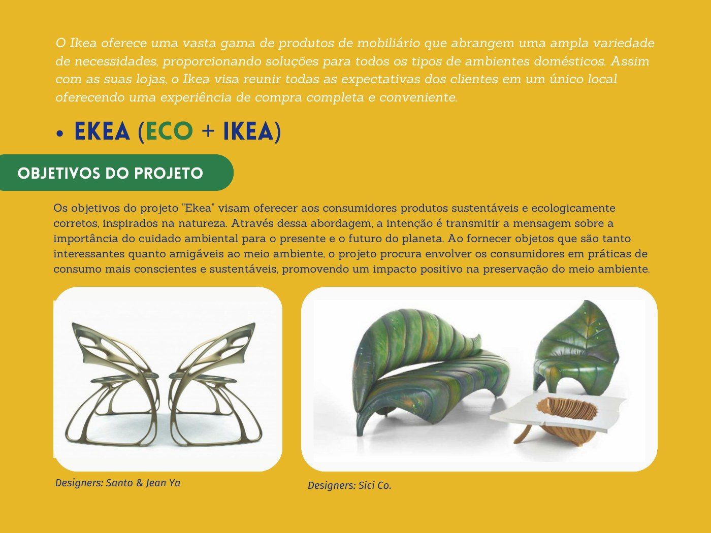
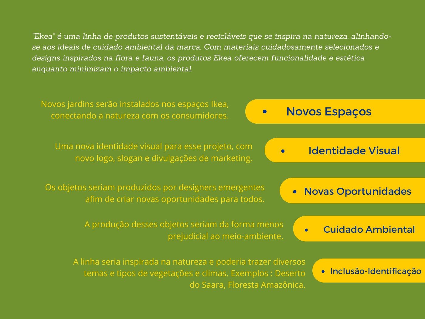
EKEA is a line of sustainable, recyclable products inspired by the flora and fauna of different places, from the Sahara to the Amazon. Alongside the products, the concept includes gardens in IKEA stores, a new visual identity and collections made by emerging designers in the least harmful way for the environment.
Individual identity proposals
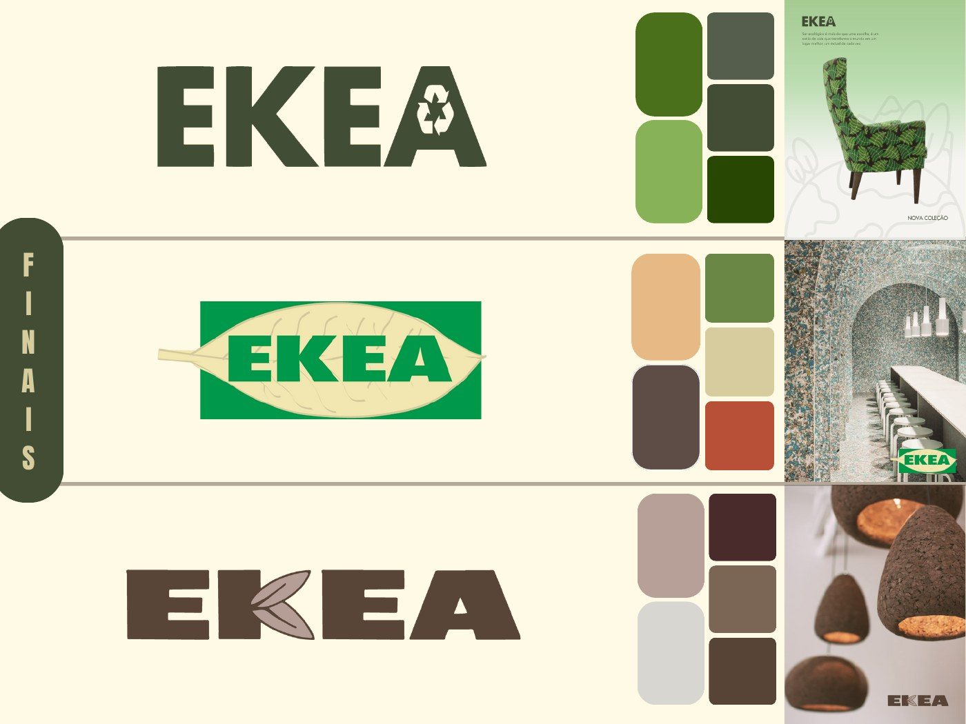
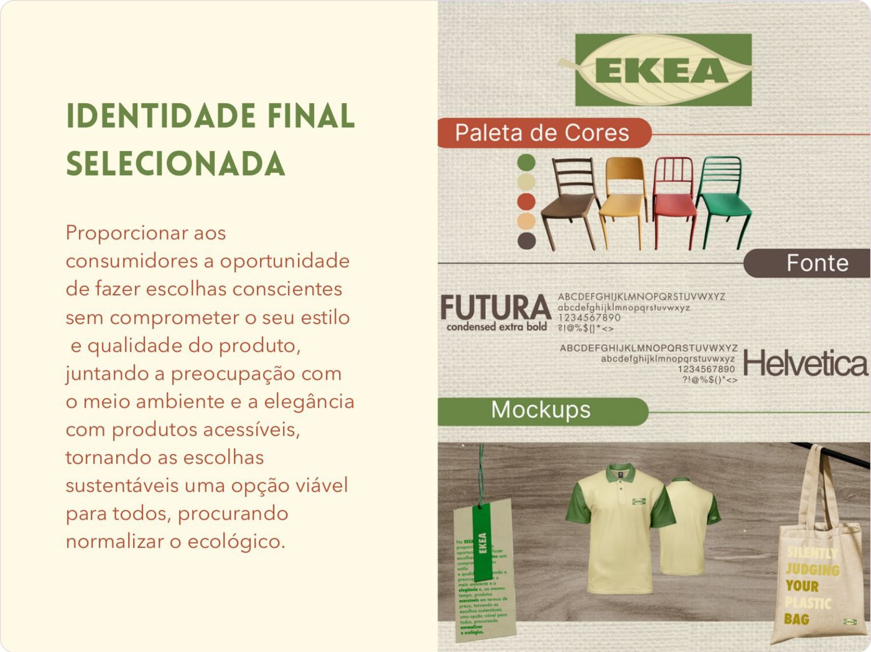
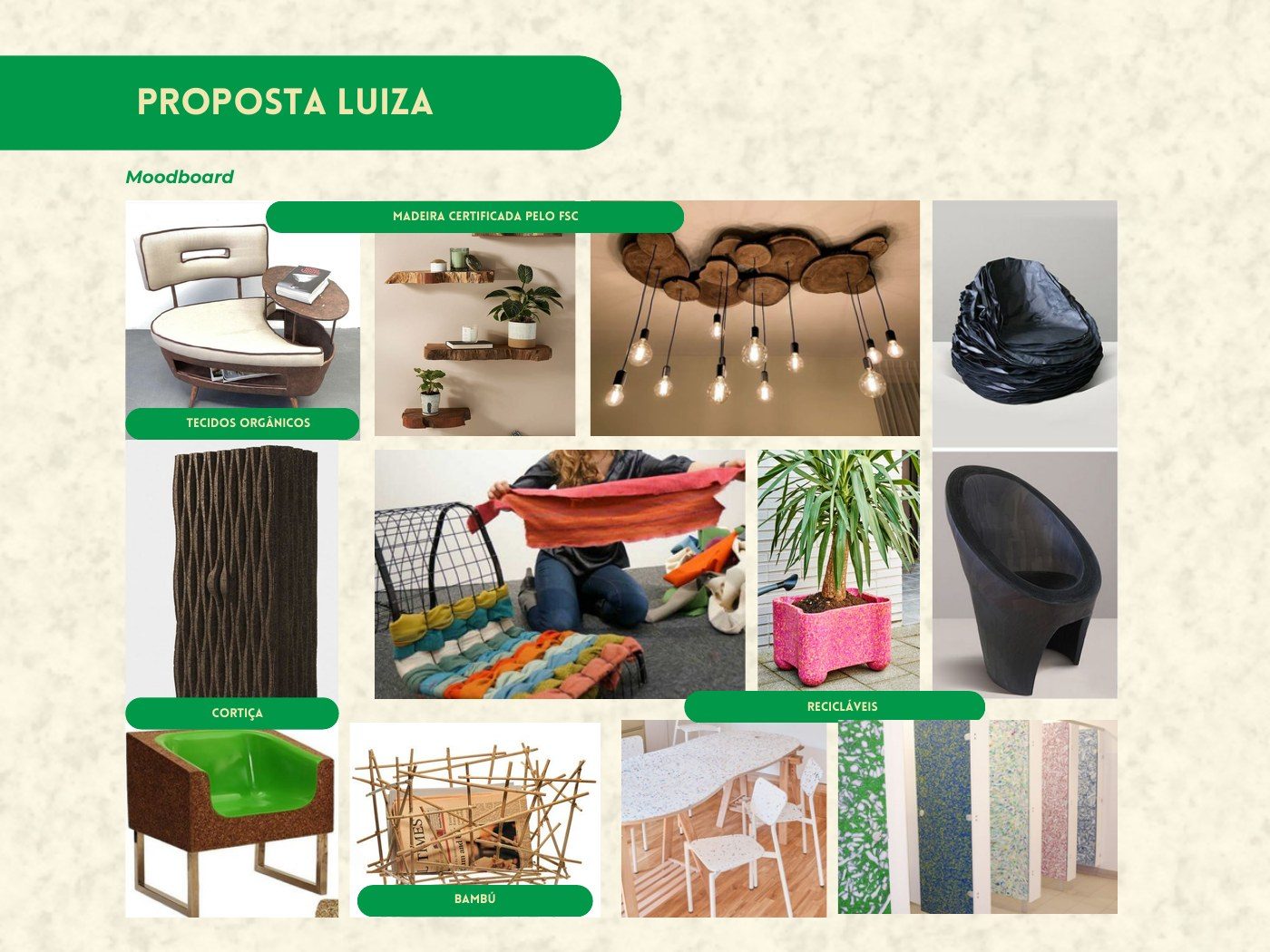
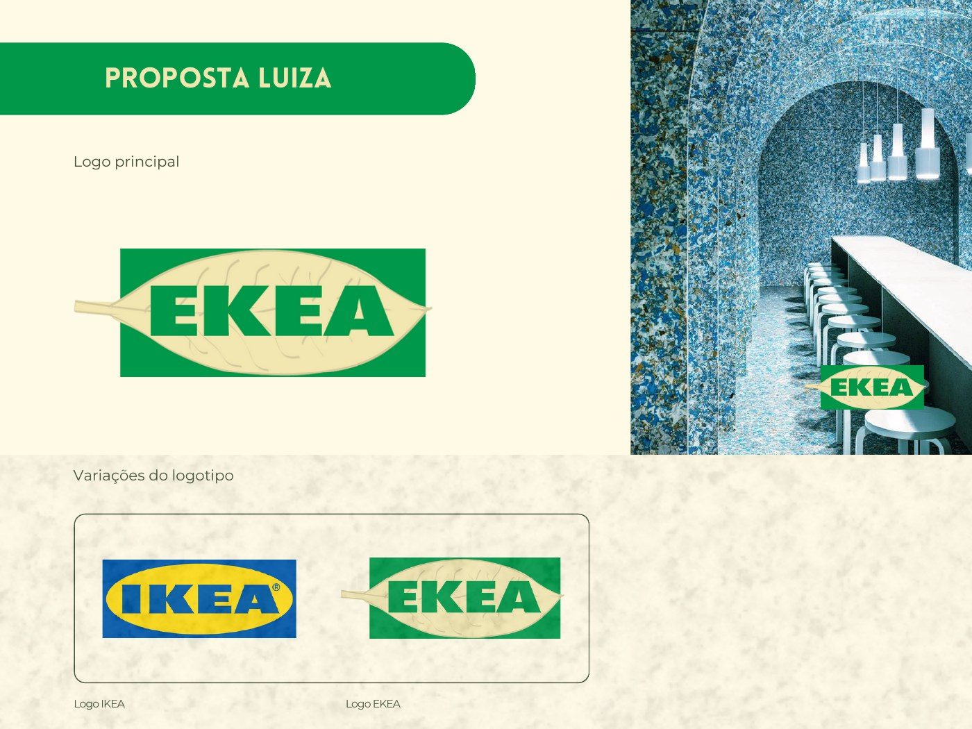
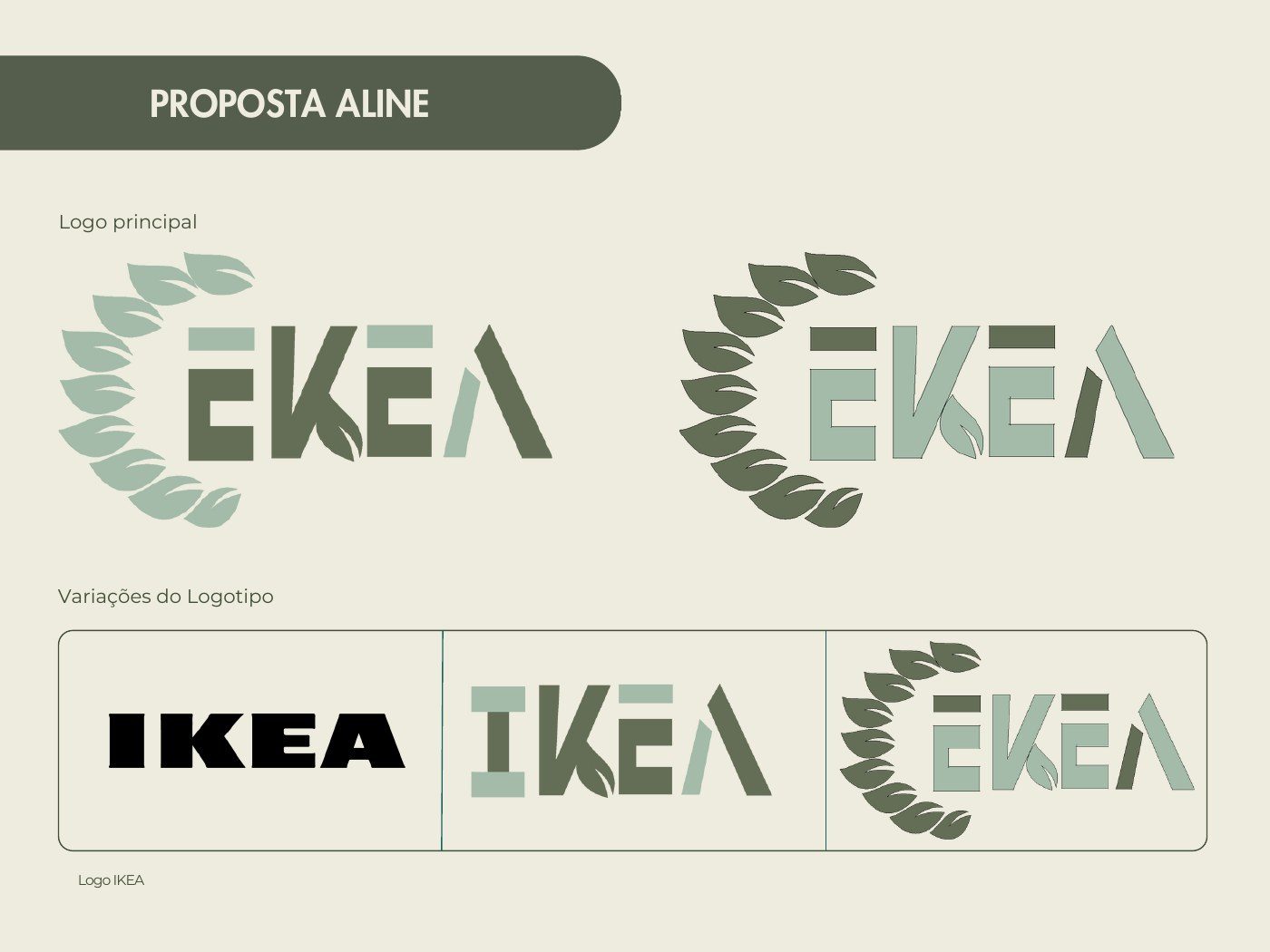
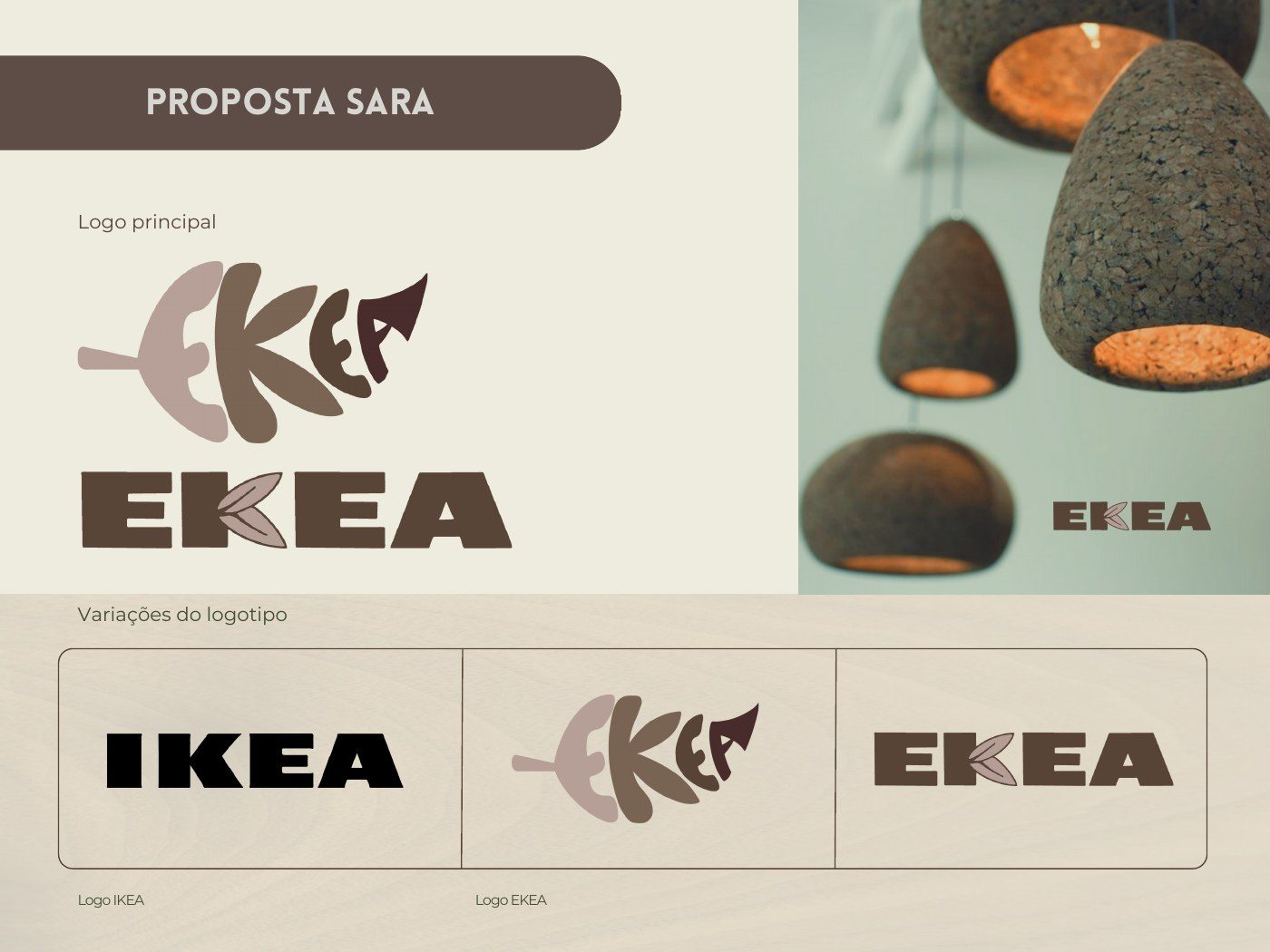
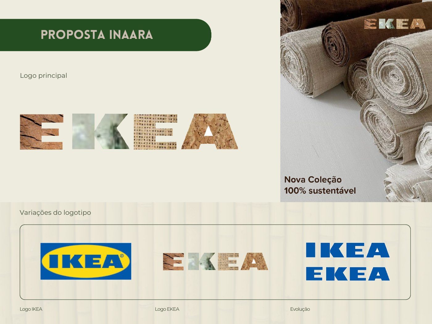
Each member of the team developed a visual identity for EKEA, with a moodboard, logo, typography, colour palette and a marketing poster. My proposal combined FSC-certified wood, organic fabrics, cork and bamboo with a bold green logo set in Futura Condensed Extra Bold.
The selected identity
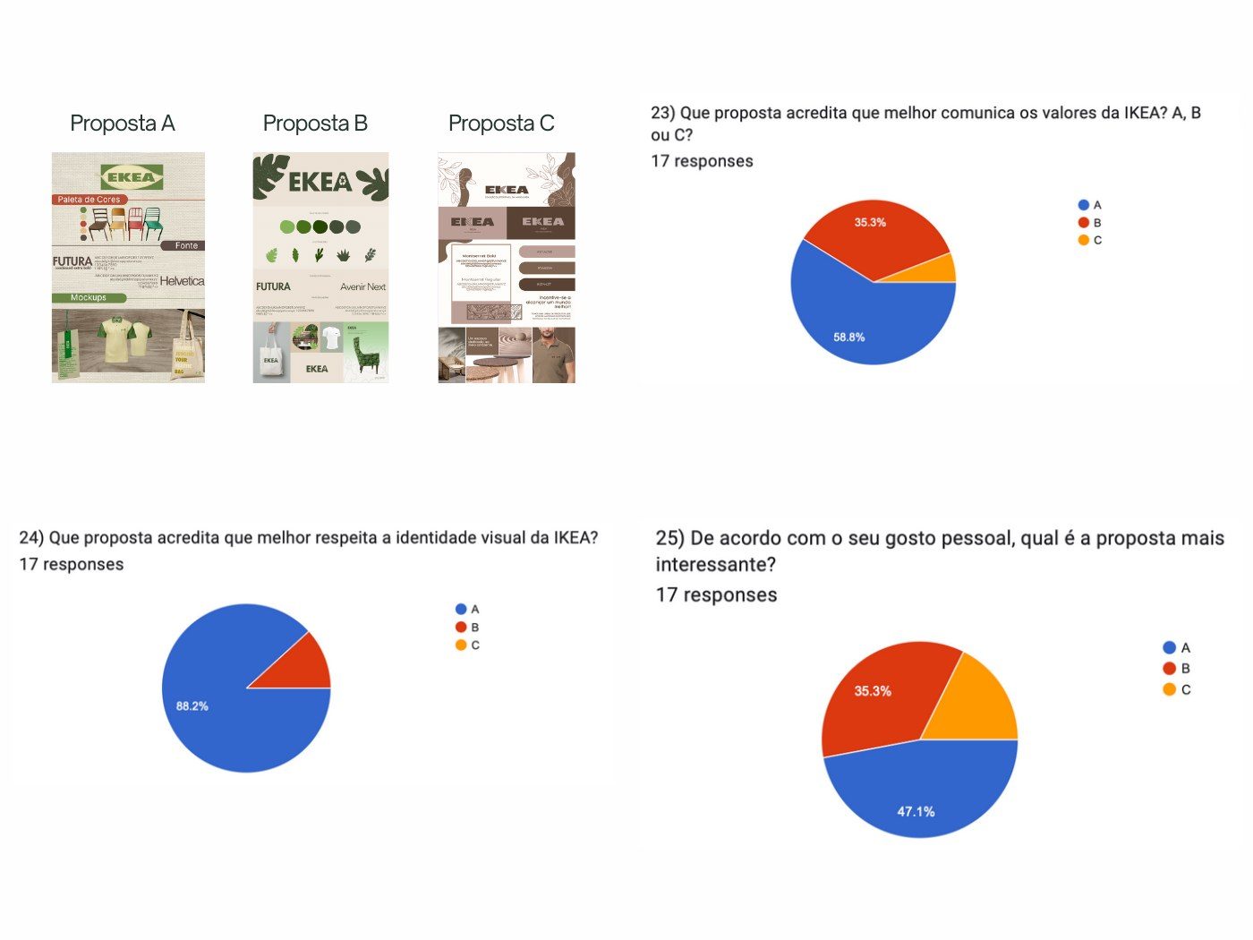
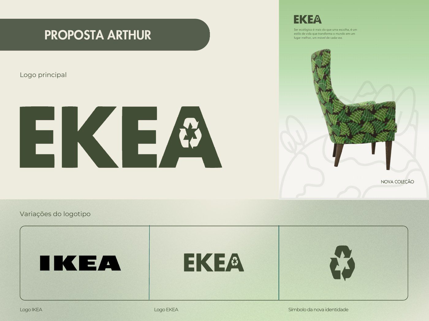
Three identities went through to the final evaluation and a questionnaire, and mine was selected. Its goal is to let consumers make conscious choices without compromising style or quality, making sustainable options viable for everyone and normalising the ecological choice, applied to uniforms and bags in 100% recycled cotton.